Statistics are tricky. Consider this: of two treatments for kidney stones, Treatment A is better on average for large stones and small stones. But consider all stones together and Treatment B is better. This is Simpson’s paradox.
Here’s the scenario (and it’s taken from a real medical study). Kidney stones can be classified by size – big ones and small ones. The study considers how successful two different treatments are for these kidney stones: Treatment A is full surgery and Treatment B is less invasive, involving only a needle and wire, and maybe some ultrasonic stone pulverisation.
This table shows the number of patients treated for each combo, the number of successful operations, and therefore the overall success percentage for that combo.
| Treatment A | Treatment B | |
| Small stones | 93% (81/87) | 87% (234/270) |
| Large stones | 73% (192/263) | 69% (55/80) |
It seems pretty obvious that you should always go with Treatment A; it is 6% more likely to be successful for small kidney stones and 4% more likely to be successful for large ones.
Hang on, though. What if we add the groups together? Rather than looking at large and small stones separately, let’s add the two sets of numbers from that first table and see what shakes out.
350 patients had Treatment A (87+263). 273 were successful (81+192). That equals a 78% success rate. 350 patients had Treatment B (270+80), and 289 were successful (234+55). Which is… 83%?!? For Treatment B? So now it’s better by 5%?
| Treatment A | Treatment B | |
| All stones | 78% (273/350) | 83% (289/350) |
This is Simpson’s paradox. It’s not really a paradox, just a demonstration of the ways that the same data can tell you a different story depending on how you subdivide it.
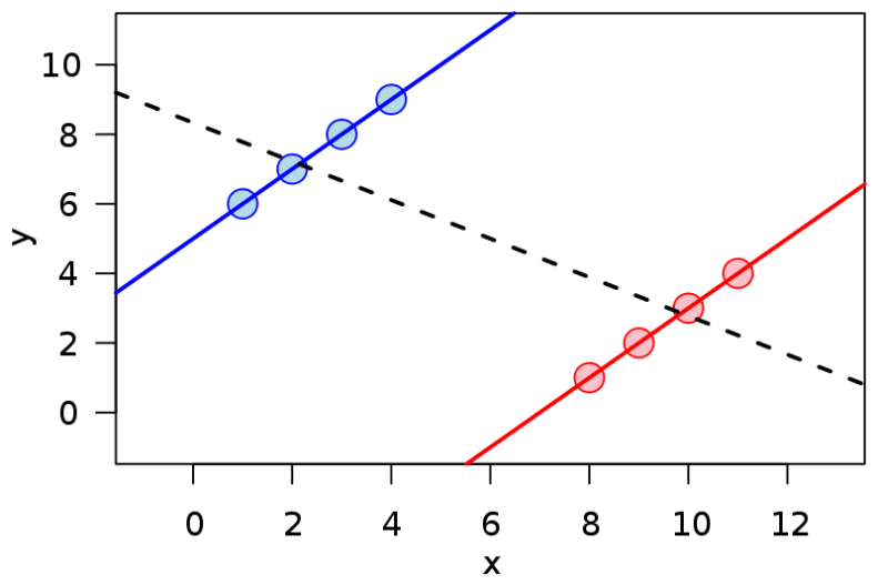
The graph at the top of this post illustrates that quite succinctly. If you like graphs, that is. If you consider the blue group alone, you can see a positive trend. If you consider the red group alone, you can see a positive trend. If you look at both groups together, there’s an obvious overall negative trend.
So, what was actually going on in the kidney stone data? Underneath these results was one simple fact: the success of the treatment wasn’t tied only to the choice of treatment. Instead, the doctors chose Treatment B for less severe cases, so it (of course) had a higher success rate.
Simpson’s paradox occurs in many places – the Wikipedia article cites baseball statistics and gender bias studies – and I see it as a very good lesson about how people can be fooled by poorly understood numbers.

2 Replies to “Kidney stone paradox”